
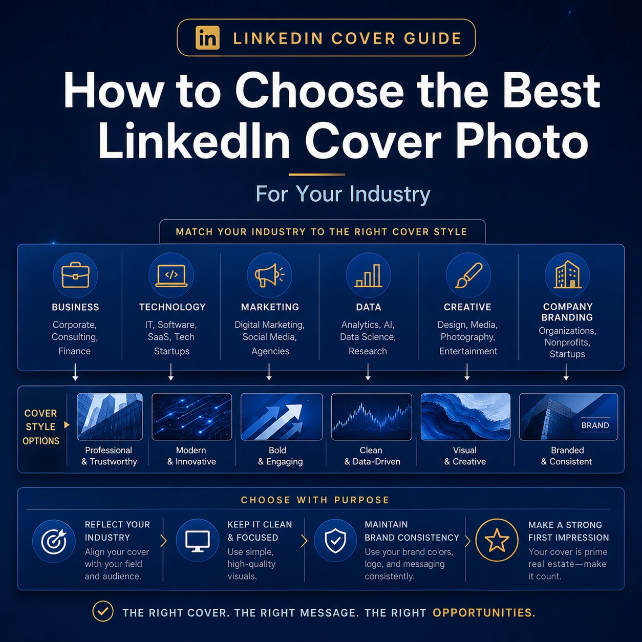
Choosing a LinkedIn cover photo looks simple at first. You pick a nice image, upload it, and move on. But if you want your profile to feel professional, the banner needs to do more than fill empty space.
Your LinkedIn cover photo should help people understand your work quickly. It should match your industry, your role, and the kind of audience you want to attract. A software engineer, finance consultant, healthcare leader, digital marketer, and teacher should not always use the same style of banner.
The good news is that you do not need a complicated design. A clean banner with the right message is usually better than a busy design with too many icons, words, and colors. This guide will help you choose the right direction for your industry without making your profile look overdesigned.
This guide is based on current LinkedIn image specifications and on the banner styles that usually work best across different professional fields. The goal is simple: help you choose a cover photo that looks relevant, clear, and genuinely useful for your profile.
Start With the Purpose of Your Cover Photo
Before you choose an image, ask one simple question: what should someone understand after seeing your profile for three seconds?
For some people, the answer is trust. For others, it is creativity, technical skill, leadership, customer focus, or industry knowledge. Your cover photo should support that message. It should not fight against it.
If your LinkedIn headline says you are a data analyst, your banner can show dashboards, charts, analytics, or clean data patterns. If your headline says you are a brand strategist, your banner can feel more creative and campaign-focused. If you are a consultant, a calm and structured design may work better than a loud visual.
A good LinkedIn banner usually does three things:
- It shows the industry or professional space you belong to.
- It supports your personal brand or company brand.
- It makes the top of your profile look more complete and intentional.
The goal is not to impress everyone. The goal is to look clear and relevant to the right people.
Use the Correct LinkedIn Cover Photo Size
Design choice matters, but the size comes first. For a personal LinkedIn profile, LinkedIn recommends a cover image size of 1584 × 396 pixels, in JPG or PNG format, under 8 MB. For LinkedIn Pages, LinkedIn recommends a 4200 × 700 pixel cover image, in PNG or JPEG format, under 3 MB.
You can confirm the latest personal profile requirements in LinkedIn’s official cover image help guide. You can also check LinkedIn’s official Page image specifications if you are designing for a business page.
| LinkedIn Use | Recommended Size | Best For | Main Design Risk |
|---|---|---|---|
| Personal profile cover photo | 1584 × 396 px | Individual professionals | Profile photo overlap and mobile cropping |
| LinkedIn Page cover photo | 4200 × 700 px | Companies, brands, and organizations | Text or logos too close to the edges |
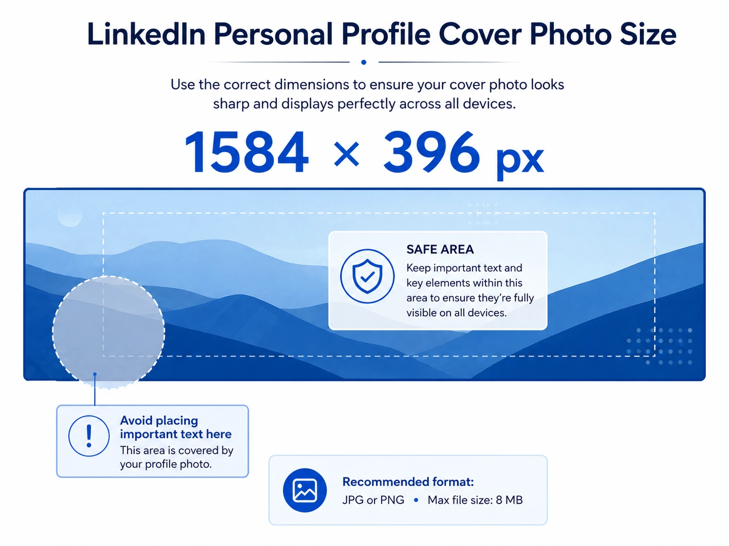
Because LinkedIn can display the banner differently on desktop and mobile, do not place important text near the edges. The safest area is usually the center-right part of the design. Keep the lower-left side quieter because your profile photo appears there.
Think About Your Industry Before Choosing the Style
Every industry has a different visual language. A banner that works well for a designer may look too casual for a financial advisor. A banner that works for a corporate executive may look too plain for a creative director.
This does not mean every finance profile must look the same, or every developer must use a code background. It simply means your design should feel natural for your field.
When choosing a banner, think about three things:
- Your audience: recruiters, clients, employers, founders, students, patients, partners, or investors.
- Your message: what you want to be known for.
- Your tone: serious, modern, friendly, technical, creative, calm, or premium.
If these three things match, your banner will feel more professional.
Best LinkedIn Cover Photo Ideas by Industry
Here are practical banner directions for different industries and roles. Use them as starting points. You can adjust the colors, text, and imagery to match your own profile.
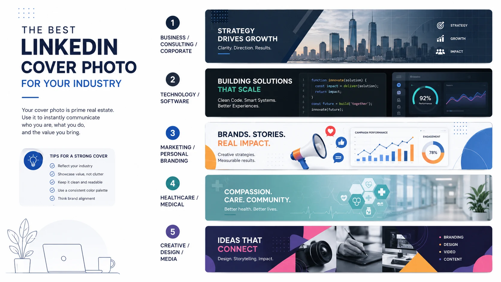
Business, Consulting, and Corporate Professionals
Business and consulting profiles usually need a cover photo that feels clean, organized, and reliable. For more formal roles, corporate professionals can also use city architecture, office details, premium textures, strategy diagrams, or simple growth-themed graphics.
This type of banner should not feel too playful. It should make the profile look stable and easy to trust. Navy, slate, white, dark green, and muted gold usually work well for this space.
Good banner ideas: a clean city skyline, a subtle strategy grid, a premium dark blue background, a soft office photo, or an abstract design with clear lines.
Avoid: too many buzzwords, random arrows, fake business charts, or a design that looks like a sales poster.
Example message: “Strategy, operations, and business growth.”
Technology, Software, and Web Development
Technology professionals can use banners that show code, software architecture, cloud systems, user interface layouts, product screens, or clean digital patterns. The goal is to show technical identity without making the design look like a hacker wallpaper.
Developers often make the mistake of choosing a dark background full of random code. That can work in some cases, but a cleaner design is usually better. A simple code editor crop, a wireframe, or a system diagram can feel more professional.
Good banner ideas: clean code layout, UI wireframe, backend architecture diagram, cloud system graphic, API connection pattern, or modern dark-mode workspace.
Avoid: unreadable code, neon overload, fake cybersecurity visuals, or too many programming language logos.
Example message: “Building reliable web and software systems.”
Data, Analytics, AI, and Machine Learning
Data and AI profiles should show clarity, not confusion. A good banner can use dashboards, charts, model diagrams, analytics screens, data pipelines, or network-style visuals. The design should make complex work feel structured.
A good rule here is to make the banner look intelligent and organized. It should suggest analysis, systems, and clarity, not noise.
For AI roles, avoid using generic robot faces unless that fits your brand. Many AI banners look the same. A better choice is a clean neural network pattern, a model workflow, or a dashboard with a strong visual hierarchy.
Good banner ideas: analytics dashboard, data pipeline illustration, clean chart background, neural network pattern, database grid, or AI workflow diagram.
Avoid: sci-fi robots, fake glowing brains, crowded charts, or text that sounds too technical for the audience.
Example message: “Turning data into clear business decisions.”
Marketing, Advertising, and Personal Branding
Marketing professionals can use more color and energy than many other industries. But the design still needs to look controlled. Your banner should show that you understand communication, not just design tools.
Campaign visuals, content calendars, audience growth concepts, funnel graphics, media cards, brand moodboards, and analytics dashboards can all work well. The key is to keep one clear idea in the design.
Good banner ideas: digital campaign collage, content strategy board, social media tiles, growth dashboard, brand color palette, or simple funnel visual.
Avoid: too many icons, too much text, loud colors without balance, and generic “digital marketing” graphics.
Example message: “Clearer messaging. Better campaigns. Smarter growth.”
Finance, Banking, Accounting, and Real Estate
Finance and real estate banners should feel trustworthy and polished. A strong design can use city buildings, financial charts, premium textures, clean document layouts, property visuals, subtle data lines, or an urban LinkedIn cover photo with a calm city feel.
These profiles usually benefit from restraint. You do not need bright colors or aggressive sales language. A calm design can say more than a loud one.
Good banner ideas: navy background with subtle chart lines, skyline image, premium marble texture, modern office building, financial dashboard, or clean property photo.
Avoid: money stacks, flashy trading screens, cartoon coins, or anything that feels like a get-rich-quick ad.
Example message: “Financial clarity, planning, and long-term value.”
Healthcare, Medical, and Wellness Professionals
Healthcare profiles should feel calm, clean, and human. The banner can show a clinical environment, soft abstract medical shapes, patient-care imagery, healthcare technology, simple blue and green gradients, or a soft nature LinkedIn cover photo when the role is connected to wellness or care.
The tone matters a lot here. You want the design to feel caring and competent. Avoid anything graphic, alarming, or too cold.
Good banner ideas: soft medical blue background, healthcare team photo, calm hospital corridor, clean lab image, patient support visual, or simple wellness pattern.
Avoid: graphic procedure images, crowded hospital scenes, dramatic red colors, or visuals that may make people uncomfortable.
Example message: “Care, quality, and better patient experiences.”
Education, Training, and Coaching
Education and training profiles should feel clear, helpful, and easy to approach. Good visuals include books, learning paths, classroom details, online learning screens, simple icons, or calm abstract backgrounds.
If you work in corporate training, keep the banner more professional. If you work with younger students, a warmer and more friendly style can work better.
Good banner ideas: learning path graphic, open notebook, clean classroom, online course screen, book texture, or simple knowledge map.
Avoid: childish graphics for adult audiences, too many school icons, or text that feels like a motivational poster.
Example message: “Learning experiences that build real skills.”
Creative, Design, Photography, and Media
Creative professionals have more room to show personality. Your cover photo can act like a small portfolio preview. Use strong typography, project thumbnails, a moodboard, a clean collage, or one bold abstract LinkedIn cover photo that reflects your style.
Still, the design should be edited. A creative banner does not need to show every skill at once. Pick one direction and let it breathe.
Good banner ideas: portfolio strip, brand moodboard, typography layout, photography crop, color palette, or design-system preview.
Avoid: mixing too many styles, tiny project screenshots, low-quality images, or a banner that looks more like a poster than a profile header.
Example message: “Designing clean, memorable visual experiences.”
Sales, Customer Success, and Business Development
Sales and customer success profiles should show confidence, movement, and relationships. A good banner can use pipeline visuals, network lines, customer journey graphics, account growth themes, or professional team imagery.
Try not to make it feel like a hard-sell advertisement. People trust sales professionals who look helpful and clear, not pushy.
Good banner ideas: simple sales pipeline, client relationship map, customer journey line, growth dashboard, or calm business meeting image.
Avoid: “buy now” language, loud arrows, fake handshake stock photos, or too many achievement numbers.
Example message: “Helping teams build better customer relationships.”
Job Seekers and Students
If you are a job seeker or student, your banner should make your direction clear. You do not need to look like a big company. You just need to show that you are serious about your field.
Choose a banner related to your target role. A student interested in software can use a clean technology banner. A student interested in finance can use a simple business or data-focused banner. A job seeker in marketing can use a clean campaign or branding visual.
Good banner ideas: industry-related background, short value statement, clean learning theme, portfolio preview, or simple professional pattern.
Avoid: generic motivational quotes, random travel photos, blurry images, or banners that do not match your career direction. If you do use a quote-style LinkedIn cover photo, keep the wording short and directly connected to your field.
Example message: “Aspiring data analyst focused on business insights.”
How to Match the Banner With Your Personal Brand
Your industry gives you the direction, but your personal brand gives the banner its personality. Two people in the same industry can use very different covers.
For example, a finance executive may want a premium and formal banner. A fintech founder may want something more modern and digital. A freelance designer may want a bold creative banner. A UX researcher may prefer a cleaner and more structured design.
Ask yourself these questions before choosing the final image:
- Do I want to look more corporate, modern, creative, friendly, or technical?
- Does this banner match my profile photo and headline?
- Would my target client, recruiter, or employer understand the message quickly?
- Is the design still readable on mobile?
- Does it look professional without trying too hard?
If the answer is yes, the banner is probably a good fit.
Use Text Carefully
Text can make a LinkedIn cover photo stronger, but only when it is short. A banner is not the place for a full bio, a long service list, or a paragraph about your experience.
A short line can help. For example:
- “Product design for SaaS teams.”
- “Data analytics for better decisions.”
- “Helping brands grow with clear content.”
- “Healthcare operations and patient experience.”
These lines work because they are easy to read. They do not make the viewer think too hard.
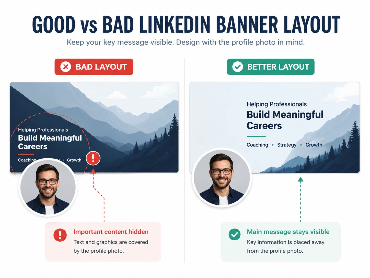
Keep the font large enough to read. Use strong contrast between the text and background. The WCAG contrast guidance is a useful reminder that text needs enough contrast to stay readable. If the text disappears into the image, simplify the background or add a soft overlay.
Choose Colors That Fit the Industry
Color changes the mood of a banner very quickly. Dark blue often feels corporate and trustworthy. Green can feel calm, financial, or sustainable. Black and charcoal can feel premium. Bright colors can feel creative or energetic.
Here is a simple color guide:
| Industry or Role | Good Color Direction | Why It Works |
|---|---|---|
| Corporate and consulting | Navy, slate, white, muted teal | Clean, serious, and reliable |
| Technology and software | Charcoal, cobalt, cyan, white | Modern and technical |
| Data and AI | Indigo, teal, dark blue, light gray | Analytical and structured |
| Marketing and creative | Purple, coral, blue, warm accents | Energetic and expressive |
| Finance and real estate | Navy, emerald, gold, white | Trustworthy and premium |
| Healthcare and wellness | Blue, green, white, soft gray | Calm, clean, and caring |
You do not have to follow these colors exactly. But if you are unsure, start with a professional base color and use one accent color only. Too many colors can make the banner feel messy.
Keep the Layout Simple
A LinkedIn banner is wide and short. That means there is not much vertical space. If you add too many elements, the design becomes hard to read.
A strong layout usually has one main focal point. That focal point might be a short headline, a product screenshot, an abstract visual, a person, a skyline, or a portfolio strip.
The Nielsen Norman Group explains visual hierarchy as guiding the eye toward the most important elements first. That idea works very well for LinkedIn banners. If everything is equally bold, nothing stands out.
Use this simple layout rule:
- One main message.
- One main visual direction.
- One or two brand colors.
- Enough empty space around the important part.
That is usually enough.
Personal Profile vs Company Page Banner
A personal LinkedIn cover photo and a company page cover photo should not always use the same design. A personal profile is about an individual. A company page is about a brand.
For a personal profile, focus on expertise, niche, or professional identity. For a company page, focus on brand promise, audience, product category, or service value.
| Banner Type | Best Message | Best Visual Direction |
|---|---|---|
| Personal profile | Your role, expertise, or niche | Industry visual, clean text, personal brand style |
| Company page | Brand promise, service, product, or audience | Brand colors, product visuals, team image, campaign message |
If you run a business, you can make both banners feel connected. Use similar colors and tone. But adjust the message for each page.
Common Mistakes to Avoid
Many LinkedIn banners fail because they try to do too much. A professional banner should make your profile clearer, not more confusing.
Here are mistakes to avoid:
- Using tiny text: If people cannot read it on mobile, remove it.
- Adding too many icons: A banner with ten icons usually looks cheap.
- Using a blurry image: Low-quality images make the whole profile feel less serious.
- Ignoring the profile photo area: Important details can get covered.
- Using unrelated scenery: A random mountain or beach photo may look nice, but it may not support your professional message.
- Copying a common template without editing it: Templates are useful, but your banner should still feel like it belongs to your profile.
The safest fix is to simplify. Remove one line of text. Remove one icon. Reduce one color. Add more space. Most banners improve quickly when they become cleaner.
A Simple Checklist Before You Upload
Before uploading your cover photo, use this quick checklist:
- The image is the correct size for the profile or page.
- The main message is easy to understand.
- The design matches your industry and role.
- The text is short and readable.
- Important details are not near the edges.
- The lower-left area is not crowded on personal profile banners.
- The colors match your personal brand or company brand.
- The image looks clear on both desktop and mobile.
If the banner passes this checklist, it is ready to use.
Final Thoughts
The best LinkedIn cover photo for your industry is not always the most beautiful image. It is the image that makes your professional message clearer.
If you are unsure which direction to choose, start with the audience you want to impress most. Then pick a simple visual style that supports that goal. In most cases, a calm, relevant, easy-to-read banner will outperform a flashy one.
Start with your industry. Then think about your audience, your role, and the feeling you want your profile to create. Keep the design clean. Use readable text. Avoid clutter. Make sure the banner still looks good on mobile.
When your cover photo matches your work, your profile feels more complete. It shows that you care about how you present yourself. That small detail can make your LinkedIn profile look more credible before someone even reads your full experience.
FAQs About Choosing a LinkedIn Cover Photo
What is the best LinkedIn cover photo size?
For a personal LinkedIn profile, the recommended cover photo size is 1584 × 396 pixels. For a LinkedIn Page, the recommended cover image size is 4200 × 700 pixels.
Should I add text to my LinkedIn cover photo?
Yes, but only if the text is short and useful. A simple line about your role, industry, or value can help. Long text usually makes the banner harder to read.
What type of LinkedIn banner is best for job seekers?
Job seekers should choose a banner that matches the role they want. A software job seeker can use a clean technology banner. A finance job seeker can use a business or analytics-style banner. The banner should support the career direction.
Should my LinkedIn cover photo match my industry?
Yes, in most cases. It does not need to be obvious or boring, but it should feel connected to your work. A relevant banner makes your profile easier to understand.
Can I use the same banner for my personal profile and company page?
You can use a similar style, but the exact same image is not ideal. Personal profiles and LinkedIn Pages use different recommended sizes and have different design goals.