
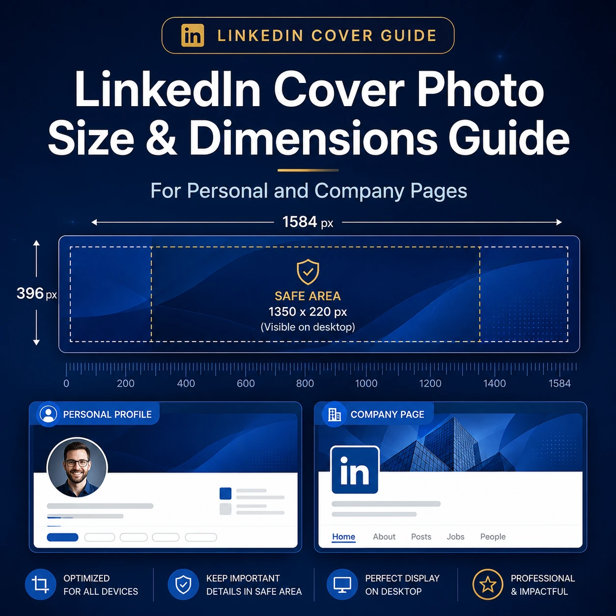
Your LinkedIn cover photo is one of the first things people see when they visit your profile or company page. It sits at the top of the page, shapes the first visual impression, and helps your page look more complete.
But the size matters. If your banner is too small, it may look blurry. If the dimensions are wrong, LinkedIn may crop it in a way that cuts off text, logos, or key design details. If you use the same image for both a personal profile and a company page, it may not fit properly because both placements use different banner ratios.
This guide explains the correct LinkedIn cover photo sizes for personal profiles and company pages, along with safe zone advice, file format tips, and common mistakes to avoid.
Need a ready-made banner instead of designing one from scratch? You can browse free professional designs on the LinkedInCoverPhotos.com home page.
Quick LinkedIn Cover Photo Size Table
| LinkedIn Image Type | Recommended Size | Aspect Ratio | Best File Type | Max File Size |
|---|---|---|---|---|
| Personal Profile Cover Photo | 1584 × 396 px | 4:1 | JPG or PNG | 8 MB |
| Company Page Cover Photo | 4200 × 700 px | 6:1 | PNG or JPEG | 3 MB |
| Company Page Logo | 400 × 400 px recommended | 1:1 | PNG or JPEG | 3 MB |
| Personal Profile Photo | 400 × 400 px recommended | 1:1 | JPG or PNG | 8 MB |
The most important thing to remember is simple: a personal LinkedIn cover photo and a company page cover photo are not the same size. A personal banner uses a 4:1 layout. A company page banner is even wider and uses a 6:1 layout.
For official LinkedIn Page image requirements, you can also check LinkedIn’s image specifications for LinkedIn Pages and Career Pages.
LinkedIn Personal Profile Cover Photo Size
The recommended LinkedIn cover photo size for a personal profile is 1584 × 396 pixels. This is the banner that appears behind your profile photo at the top of your personal LinkedIn profile.
A good personal profile banner should look clean, easy to understand, and connected to your professional identity. It should support your profile without making it feel crowded.
| Canvas Size | 1584 × 396 px |
|---|---|
| Aspect Ratio | 4:1 |
| Best File Types | JPG or PNG |
| Max File Size | Less than 8 MB |
| Best Design Area | Center-right side |
| Main Area to Avoid | Lower-left area near the profile photo |
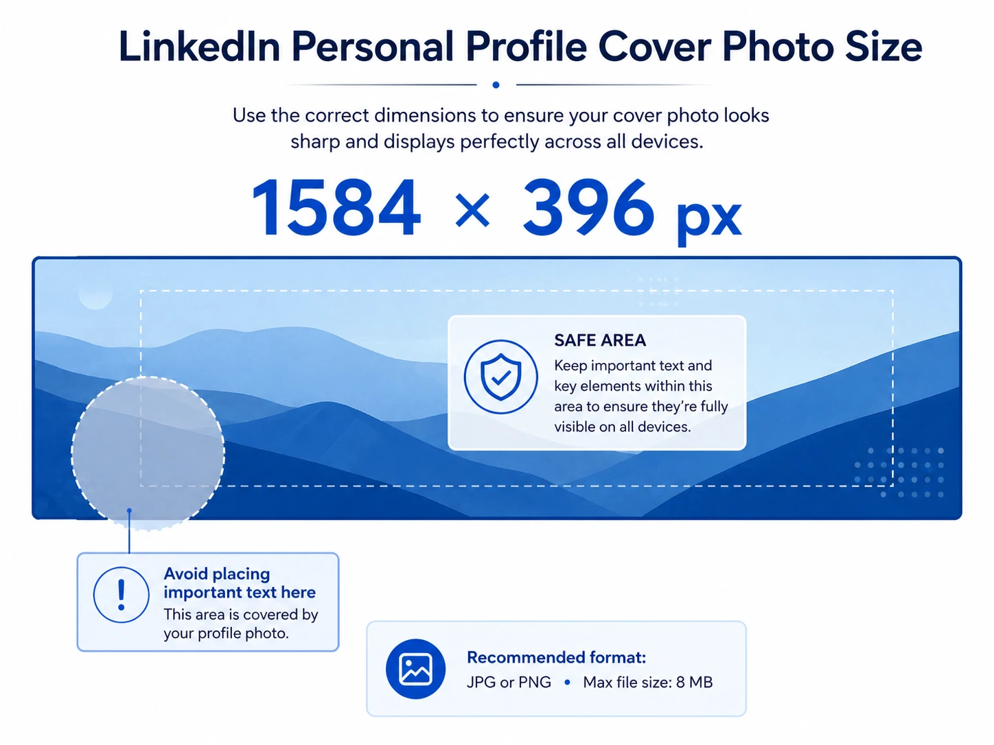
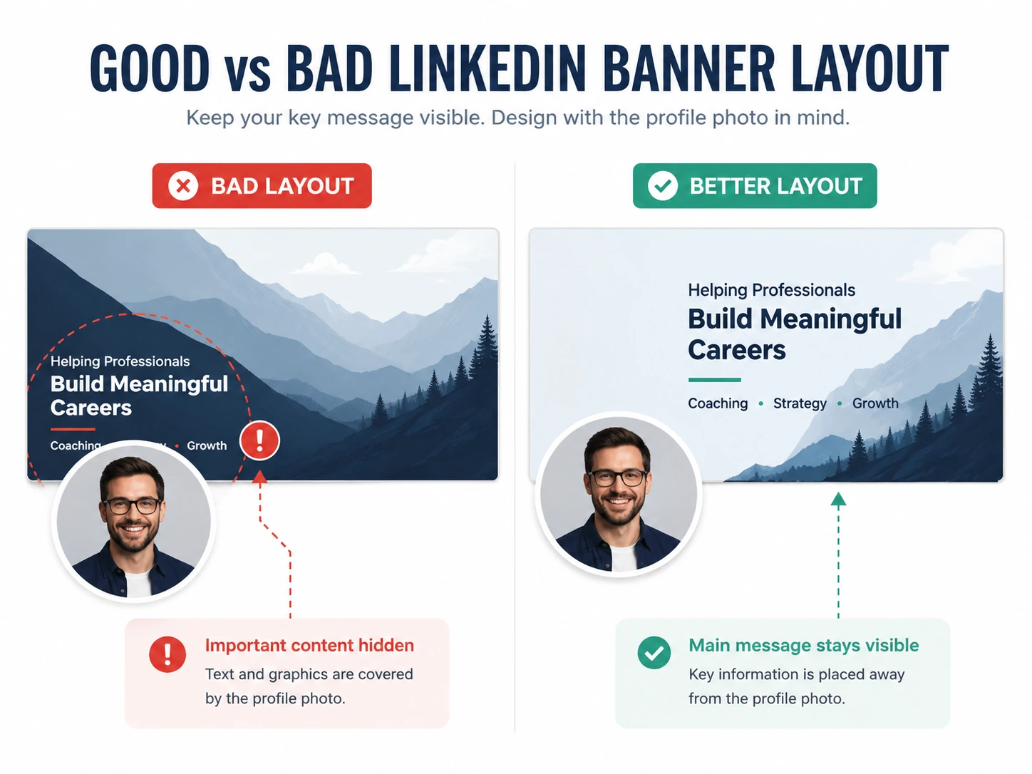
The profile photo overlaps the lower-left area of the cover image. That is why you should avoid placing text, logos, icons, or important details in that part of the design. If your banner includes a short message, place it more toward the center or right side.
LinkedIn Company Page Cover Photo Size
The recommended LinkedIn company page cover photo size is 4200 × 700 pixels. This is the banner used on LinkedIn Pages for businesses, brands, agencies, startups, and company profiles.
Company page banners are much wider than personal banners. They are built for brand presentation, so the layout should stay simple and balanced.
| Canvas Size | 4200 × 700 px |
|---|---|
| Aspect Ratio | 6:1 |
| Best File Types | PNG or JPEG |
| Max File Size | 3 MB |
| Best Design Area | Center area |
| Main Area to Avoid | Outer edges and lower-right area |
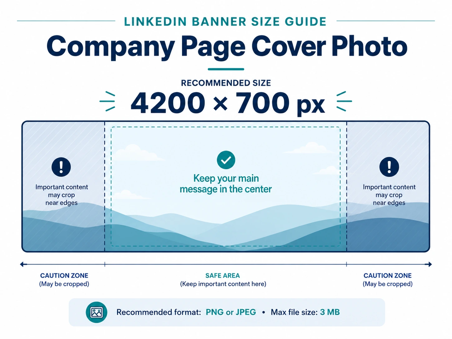
Company page cover images can crop differently on different screen sizes. The safest approach is to keep your main message, logo, and important visual elements closer to the center of the banner.
Personal Profile vs Company Page Cover Photo
Many people try to use one LinkedIn banner for both their personal profile and company page. That usually does not work well because the shapes are different.
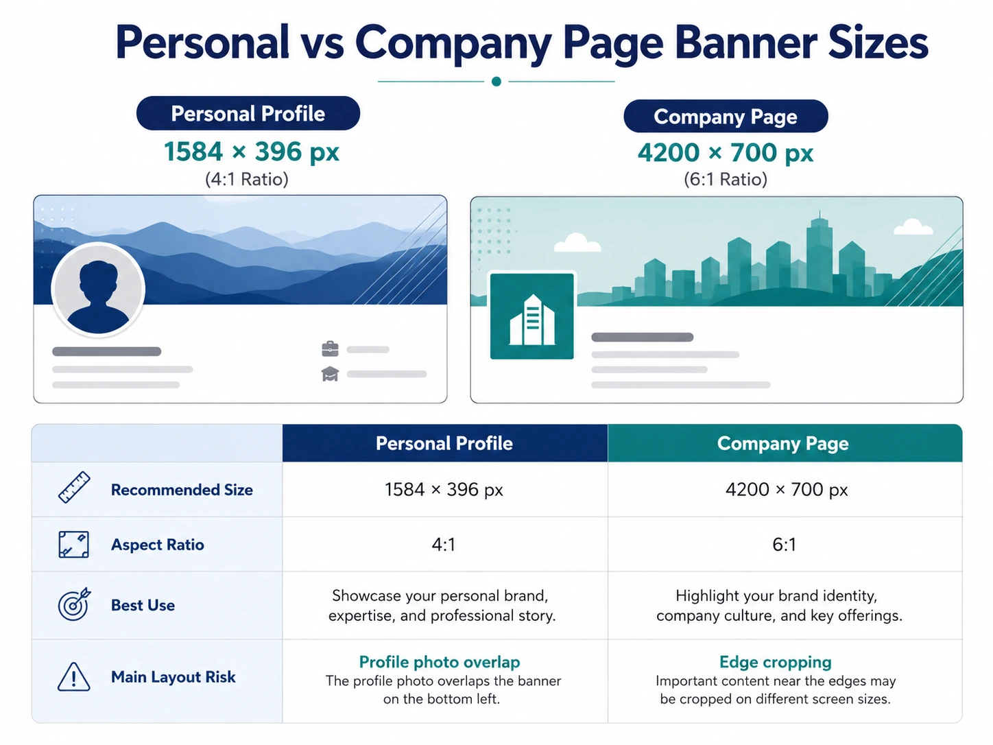
| Feature | Personal Profile Cover | Company Page Cover |
|---|---|---|
| Recommended Size | 1584 × 396 px | 4200 × 700 px |
| Aspect Ratio | 4:1 | 6:1 |
| Best For | Individual professionals | Brands and businesses |
| Main Layout Risk | Profile photo overlap | Edge cropping |
| Best Text Placement | Center-right | Center |
| Design Style | Personal branding | Company branding |
If you want both banners to look professional, create separate designs for each one. You can keep the same colors and branding style, but the layout should be adjusted for each size.
LinkedIn Cover Photo Safe Zone
A safe zone is the part of your image where important content is less likely to be hidden or cropped. LinkedIn does not provide one official safe zone template for every device, but safe spacing still matters.
Your banner can look slightly different depending on screen size, browser width, and whether someone views your profile on desktop or mobile.
- For personal profiles: avoid placing important text in the lower-left area because the profile photo can cover it.
- For company pages: avoid placing key details too close to the left edge, right edge, top, or bottom.
- For both: leave breathing room around your main message.
Best File Format for LinkedIn Cover Photos
LinkedIn accepts common image formats, but the best choice depends on your design.
Use JPG when:
- your banner is mainly photo-based
- the image uses gradients or soft backgrounds
- you want a smaller file size
Use PNG when:
- your banner includes text, icons, or a logo
- you want sharper edges
- the design is more graphic than photographic
For personal profiles, LinkedIn supports JPG and PNG. For company pages, LinkedIn supports PNG and JPEG. The file should also stay within LinkedIn’s size limit.
Why Your LinkedIn Banner Looks Blurry
A LinkedIn banner usually looks blurry for one of four reasons: the image is too small, it was exported in low quality, the design includes tiny text, or the wrong file type was used.
| Problem | Better Option |
|---|---|
| Small image stretched larger | Create the banner at the correct size from the start |
| Tiny text | Use fewer words and larger text |
| Low-quality export | Export in high quality |
| Wrong file type for graphic banners | Use PNG for text-heavy designs |
| Too many details | Use a simpler layout |
What to Put on a LinkedIn Cover Photo
A cover photo should support your professional identity. It does not need to say everything. In most cases, a simple visual with one short message works best.
- your job field or service area
- a short positioning line
- brand colors
- a clean abstract background
- industry-related graphics
- a short company tagline
What to Avoid on a LinkedIn Cover Photo
- long paragraphs
- too many icons
- small unreadable text
- low-quality stock images
- text placed behind the profile photo area
- important details placed too close to the edges
The banner should make your page look cleaner, not more crowded.
Best LinkedIn Cover Photo Size for Mobile
LinkedIn does not have a separate upload size for mobile. You still upload the same recommended image size: 1584 × 396 px for personal profiles and 4200 × 700 px for company pages.
The difference is how the image appears on smaller screens. Mobile viewing can crop or shift the banner slightly, which is why safe spacing matters.
LinkedIn Cover Photo Design Tips
- Keep the message short. A LinkedIn banner is seen quickly, so one short line is enough.
- Start with the right size. Do not design a square image and crop it later.
- Leave space around the profile photo. This matters most for personal profiles.
- Use brand colors carefully. Two or three main colors are usually enough.
- Avoid tiny text. Small text often looks unreadable after upload.
- Check the banner after uploading. Review it on both desktop and mobile.
Common LinkedIn Cover Photo Mistakes
- using the wrong size
- placing text on the left side of a personal banner
- trying to fit too much information into one image
- uploading a low-quality or blurry file
- ignoring how the banner looks on mobile
FAQ: LinkedIn Cover Photo Size
What is the best LinkedIn cover photo size for a personal profile?
The best LinkedIn cover photo size for a personal profile is 1584 × 396 pixels. This matches LinkedIn’s recommended 4:1 profile cover layout.
What is the best LinkedIn company page cover photo size?
The best LinkedIn company page cover photo size is 4200 × 700 pixels. This matches the current LinkedIn Page cover image specification.
Can I use the same cover photo for my personal profile and company page?
It is better to create separate designs. A personal banner and a company page banner use different dimensions, so one image usually will not fit both properly.
What file type should I use for a LinkedIn cover photo?
JPG works well for photo-based banners. PNG is usually better for designs that include text, logos, icons, or sharp graphic elements.
Why does my LinkedIn cover photo look blurry?
Your banner may look blurry if the image is too small, compressed too heavily, or exported at low quality. Create the design at the recommended size before uploading.
Where should I place text on a LinkedIn personal banner?
The safest place for text is usually the center-right part of the banner. Avoid the lower-left area because the profile photo can cover it.
Source Used for Image Specifications
This guide uses LinkedIn’s published image specification guidance for LinkedIn Pages and Career Pages, along with practical layout testing for profile-photo overlap and responsive banner display.
LinkedIn Help: Image specifications for LinkedIn Pages and Career Pages
Final Thoughts
The right LinkedIn cover photo size helps your profile or company page look clean, sharp, and professional.
For a personal profile, use 1584 × 396 pixels. For a company page, use 4200 × 700 pixels. These sizes give you the best starting point, but the layout matters just as much as the dimensions.
Keep the design simple. Leave space for cropping. Avoid placing text near the profile photo or too close to the edges. A good LinkedIn cover photo does not need to be complicated. It just needs to fit properly and support the professional image you want to present.
Browse LinkedIn Cover Photo Collections
Explore ready-made LinkedIn banner collections by style and profession, including business, technology, corporate, nature, quotes, abstract, and urban cover photos.
View Cover Collections