
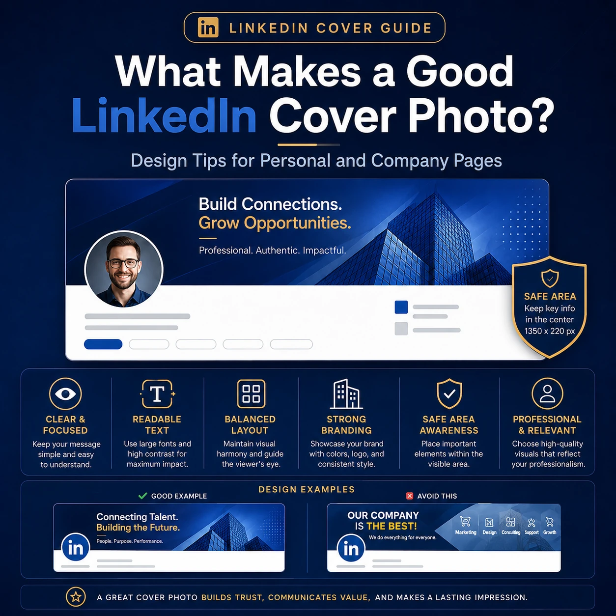
A good LinkedIn cover photo does not need to be fancy. It needs to be clear. It should help people understand who you are, what you do, and what kind of professional impression you want to create.
The cover photo sits at the top of your LinkedIn profile or company page. People may not study it for long, but they will notice the feeling it creates. A clean banner can make your profile look complete. A confusing banner can make the page feel unfinished, even when the rest of your profile is strong.
For a personal profile, the banner should support your role, industry, and personal brand. For a company page, it should support the business message, brand identity, and trust you want visitors to feel. The same design will not work for every profile. A software engineer, consultant, recruiter, designer, healthcare professional, and company founder will usually need different visual styles.
This guide is written for people who want a simple, practical answer. It follows current LinkedIn image guidance and focuses on useful design decisions, not design jargon. You can use it before choosing a ready-made banner, creating your own in a design tool, or updating the top section of your LinkedIn cover photo layout.
Quick Answer: What Makes a Good LinkedIn Cover Photo?
A good LinkedIn cover photo is clear, professional, readable, and relevant to the page it appears on. It uses the correct size, keeps important details away from risky crop areas, and supports the message of the profile or company page.
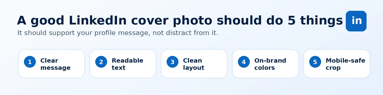
In simple words, a good cover photo should pass five checks:
- It fits the page: personal profile and company page banners have different needs.
- It looks clean: the design is not crowded with too many elements.
- It is easy to read: any text is short, large enough, and placed safely.
- It feels relevant: the style matches the person, brand, industry, or audience.
- It works on mobile: the main message still makes sense on smaller screens.
Use the Correct LinkedIn Cover Photo Size First
Before you think about colors or style, start with the correct image size. If the banner size is wrong, even a beautiful design can look blurry, stretched, or badly cropped.
For a personal LinkedIn profile, LinkedIn recommends a cover image size of 1584 × 396 pixels. LinkedIn also says profile cover images should be JPG or PNG and less than 8 MB. You can confirm this in LinkedIn’s official profile cover image guide.
For a LinkedIn Page, LinkedIn recommends a 4200 × 700 pixel cover image. LinkedIn’s Page image specifications also note that Page images must be PNG or JPEG and have a maximum size of 3 MB. You can check this in LinkedIn’s official Page image specifications.
| LinkedIn Page Type | Recommended Size | File Type | Max File Size | Best Use |
|---|---|---|---|---|
| Personal profile cover photo | 1584 × 396 px | JPG or PNG | Under 8 MB | Personal branding, job search, thought leadership, consulting, professional identity |
| Company Page cover image | 4200 × 700 px | PNG or JPEG | Under 3 MB | Brand identity, company message, campaign focus, employer branding, product positioning |
Size is not the only thing that matters. LinkedIn can display cover images differently depending on screen size, browser width, and device. That is why the safest design is usually simple. Keep important text away from edges, avoid tiny details, and leave breathing room around the main message.
Personal Profile vs Company Page: What Changes?
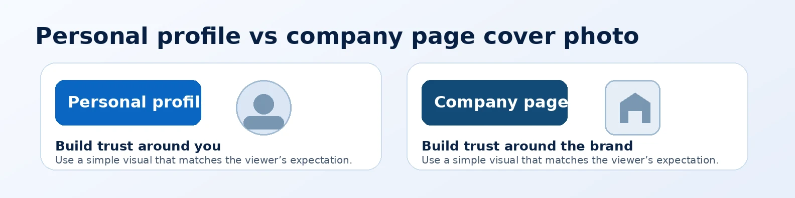
A personal LinkedIn cover photo and a company page cover image have different jobs. A personal banner builds trust around one person. A company banner builds trust around a brand.
That difference should guide the design. A personal profile can be a little more human and role-focused. It can show your professional style, industry, value, or personality. A company page should usually feel more consistent with the brand. It may use brand colors, a clear message, a product visual, or a simple company positioning line.
| Design Area | Personal Profile | Company Page |
|---|---|---|
| Main goal | Show who you are and what you are known for | Show what the company does and why it can be trusted |
| Best message | Role, niche, value, industry, or personal brand phrase | Brand promise, service area, product focus, campaign, or company mission |
| Visual style | Professional, personal, role-based, and simple | Brand-led, polished, consistent, and clear |
| Text use | Short tagline or role statement | Short brand message or campaign line |
| Biggest mistake | Using a random image that says nothing about your work | Using a busy promotional banner with too much text |
Keep the Message Simple
The best LinkedIn cover photos do not try to say everything. They support one clear idea. That idea might be your role, your industry, your offer, your company values, or your professional style.
For example, a consultant might use a calm business-style banner with a short line about strategy or growth. A developer might use a clean technology layout. A marketing professional might use a controlled creative design with campaign or analytics elements. A company page might use a branded image that explains the business in a few words.
One clear message is better than five small messages. If a visitor has to stop and decode the banner, it is probably doing too much.
Use Text Carefully
Text can make a LinkedIn banner stronger, but only when it is short and easy to read. A banner is not the right place for a paragraph, a full service list, or a long sales pitch.
Good banner text is usually short enough to read in one glance. It may be a role line, a value phrase, a company tagline, or a simple callout. If you need more than one sentence, the message may belong in your headline, About section, featured section, or company page description instead.
| Good Text Choices | Text to Avoid |
|---|---|
| “Helping SaaS teams improve customer onboarding” | A long paragraph explaining every service you offer |
| “Data analytics • BI dashboards • Decision support” | Tiny keyword lists that cannot be read on mobile |
| “Brand strategy for growing businesses” | Generic phrases like “We are the best” without context |
| Company tagline with one clear benefit | Multiple logos, badges, phone numbers, and slogans together |
Use enough contrast between the text and background. Dark text on a light background or white text on a dark background is usually safer than low-contrast text over a busy photo. Keep the font simple. Your banner should look professional, not like a flyer filled with effects.
Leave Enough Empty Space
Empty space is not wasted space. It helps the design breathe. It also makes the main message easier to notice.
A common mistake is filling the whole banner with photos, icons, words, shapes, and patterns. This may look detailed in a design tool, but it often looks messy on LinkedIn. A good banner usually has one main visual area, one message area, and enough quiet space around them.
Empty space is especially useful on personal profiles because the profile photo overlaps part of the cover image. If important details sit too close to that area, they may be blocked or look awkward.
Think About Safe Zones and Cropping
LinkedIn cover photos do not always appear in exactly the same way on every screen. Desktop, mobile, browser size, and profile layout can affect how the image is displayed.
For personal profiles, avoid placing important text near the lower-left area because the profile photo appears over the cover image. Keep the main message more toward the center or right side. For company pages, avoid placing key details too close to the edges. LinkedIn also recommends placing important information near the center of Page cover images because cropping can happen on different screens.
This is one reason simple banners perform better. They survive cropping more easily. If the design has a clean background and a short message, it is less likely to break when viewed on a smaller screen.
Match the Cover Photo With Your Industry
Your industry affects what looks credible. A bold, colorful banner may work well for a creative director, but it may feel too loud for a finance consultant. A very formal corporate banner may work for an executive, but it may feel too plain for a designer or content creator.
Here are some simple directions:
- Business cover photos work well for consultants, managers, founders, and service professionals who want a clean and reliable look.
- Corporate cover photos suit executives, enterprise teams, legal professionals, finance leaders, and people who want a more formal style.
- Technology cover photos are useful for developers, software teams, IT professionals, SaaS founders, and technical consultants.
- Abstract cover photos can work when you want a modern, polished, and flexible background without showing a specific industry.
- Nature cover photos can feel calm, thoughtful, and approachable for coaches, educators, wellness professionals, and people-focused roles.
- Quote-style cover photos can work when the message is short, readable, and aligned with your professional brand.
- Urban cover photos can fit city-based professionals, real estate, architecture, local business, consulting, and modern brand profiles.
The goal is not to copy everyone in your industry. The goal is to choose a style that feels natural to the people you want to reach.
Choose Colors That Support the Right Feeling
Color affects the way people read your profile. You do not need to overthink it, but the colors should make sense for your work.
Blue often feels professional and trustworthy. Dark navy can feel premium. Green can suggest growth, health, nature, or sustainability. Black and gold can feel high-end when used carefully. Bright colors can feel creative and energetic, but they can also look messy when too many are used together.
For personal profiles, choose colors that fit your role and personality. For company pages, start with brand colors. If the brand colors are too bright, use them as accents instead of filling the whole banner with them.
Use High-Quality Images
A blurry or stretched cover photo can make a strong profile look less professional. Use a high-resolution image and avoid screenshots that were not designed for a wide banner shape.
Photos can work well when they are clean and relevant. Patterns can work well when they are subtle. Illustrations can work well when they look polished. What usually does not work is a random stock image with no connection to your role or business.
For company pages, quality matters even more because the banner represents the brand. A low-quality image can make the company feel less serious. Keep the file clean, avoid heavy compression, and preview the banner after uploading.
Make It Consistent With the Rest of the Page
Your cover photo should not feel separate from the rest of your profile. It should match your headline, profile photo, About section, company description, and overall message.
For a personal profile, check whether the banner supports the work you want to attract. If your headline says “Product Marketing Manager,” the banner should not feel like a random travel photo unless travel is part of your brand. If your headline says “Cloud Engineer,” the banner can use clean technology visuals instead of generic business imagery.
For a company page, the banner should match the logo, brand colors, and main offer. It should also make sense beside the company description. If the company sells B2B software, the cover photo should not look like a lifestyle influencer banner. If it is a healthcare company, the design should feel trustworthy, clear, and careful.
Design Tips for Personal LinkedIn Profiles
For a personal profile, your cover photo should help people understand your professional identity faster. It should answer a simple question: what kind of work does this person do, and why should I keep reading?
Here are practical ideas:
- Use a short role-based phrase if it helps your positioning.
- Show your industry through subtle visuals, not clutter.
- Keep the left side simple because the profile photo overlaps the cover area.
- Choose a style that matches the jobs, clients, or opportunities you want.
- Avoid turning the banner into a full advertisement.
Job seekers can use a banner that supports their target role. Consultants can use one clear value statement. Creators can use a more visual style, but it should still be readable and professional.
Design Tips for LinkedIn Company Pages
For a company page, the cover image should make the brand easier to understand. A visitor should quickly know what type of company they are viewing and what feeling the brand wants to create.
A good company page cover image may include:
- A short brand message or tagline.
- A product or service theme.
- Brand colors used in a clean way.
- A campaign message, if the page is promoting something timely.
- A professional background that supports trust.
Do not overload the banner with every service, award, certification, phone number, and social handle. The company page has other sections for details. The cover image should create a strong first impression and guide people into the page.
What to Avoid in a LinkedIn Cover Photo
Most bad LinkedIn cover photos fail for simple reasons. They are not always ugly. They are just unclear, crowded, or disconnected from the profile.
| Mistake | Why It Hurts | Better Choice |
|---|---|---|
| Too much text | People cannot read it quickly, especially on mobile | Use one short message or no text at all |
| Random stock image | It looks generic and does not support your brand | Choose an image connected to your role, industry, or company |
| Low-resolution image | It makes the page look less credible | Use a high-quality image in the recommended dimensions |
| Important details near edges | They may be cropped or covered on different screens | Keep key elements closer to the safe center area |
| Too many colors | The design feels noisy and less professional | Use a small, consistent color palette |
| Design does not match the page | The visitor gets mixed signals about your work or brand | Match the banner with your headline, industry, and audience |
Examples of Good LinkedIn Cover Photo Directions
The best design direction depends on the profile goal. Here are a few simple examples:
- For a consultant: a clean business banner with a short strategy-focused message.
- For a software engineer: a simple technology background, code layout, UI grid, or product architecture visual.
- For a data professional: a clean dashboard, analytics pattern, or structured data visual.
- For a digital marketer: a campaign, content, growth, or brand strategy visual that is colorful but controlled.
- For a company page: a branded banner with one clear promise and enough empty space.
- For a job seeker: a banner that points toward the role they want, not only the role they had before.
You can also read the related guide on choosing the best LinkedIn cover photo for your industry if you want more examples by role.
A Simple Checklist Before You Upload
Before you upload your cover photo, review it like a visitor would. Do not only check it inside the design tool. Open it at full size, shrink it down, and imagine seeing it for the first time.
- Is the size correct for a personal profile or company page?
- Does the design look clear within three seconds?
- Is the text readable on desktop and mobile?
- Are important details away from crop areas and profile photo overlap?
- Do the colors match your personal brand or company brand?
- Does the banner support your headline, role, offer, or brand message?
- Does it look professional without trying too hard?
If the answer is yes, the banner is probably strong enough to use. If something feels crowded or unclear, remove one element before adding anything new.
Final Thoughts
A good LinkedIn cover photo is not about decoration. It is about communication. It helps the top of your profile or company page feel intentional, polished, and easier to understand.
Keep the design simple. Use the correct size. Make the message clear. Choose colors that fit your field. Avoid tiny text and clutter. Most importantly, make sure the banner matches the kind of trust you want to build.
When the cover photo supports the rest of the page, your LinkedIn presence feels more complete. That small visual choice can make a real difference in how people read your profile before they even scroll.
FAQs About Good LinkedIn Cover Photos
What is the best size for a LinkedIn cover photo?
For a personal LinkedIn profile, the recommended cover photo size is 1584 × 396 pixels. For a LinkedIn Page, the recommended cover image size is 4200 × 700 pixels.
What should I put on my LinkedIn cover photo?
Use something that supports your role, industry, company, or professional message. This could be a clean background, a short tagline, a branded visual, a technology pattern, a business-style image, or a simple design related to your work.
Should a LinkedIn cover photo have text?
It can have text, but the text should be short and easy to read. A role statement, tagline, or simple brand message can work well. Long text usually becomes hard to read, especially on mobile.
What makes a LinkedIn cover photo look professional?
A professional cover photo usually has a clean layout, high-quality image, readable text, consistent colors, and a clear connection to the profile or company page.
Is a personal profile banner different from a company page banner?
Yes. A personal profile banner should support the person’s professional identity. A company page banner should support the brand, business message, product, service, or company values.
How often should I update my LinkedIn cover photo?
You do not need to change it often. Update it when your role, offer, company branding, campaign, or professional direction changes. You can also refresh it if the design looks outdated or does not match your current profile.